Hey, I'm Tom. Available for new projects
Press to see another line.Branding, web design and development, UX/UI and digital strategy for brands and digital products that want to stand out, connect and grow.
Madrid · Working everywhere
Less talk. More work.
Every project has its own story, challenges and way forward. Here are a few that best show how I think and what I do.
-
40 years of history. A new identity shaped together.
Rebranding, website and digital communications for a company with 40 years of history, shaped together with its team.
View project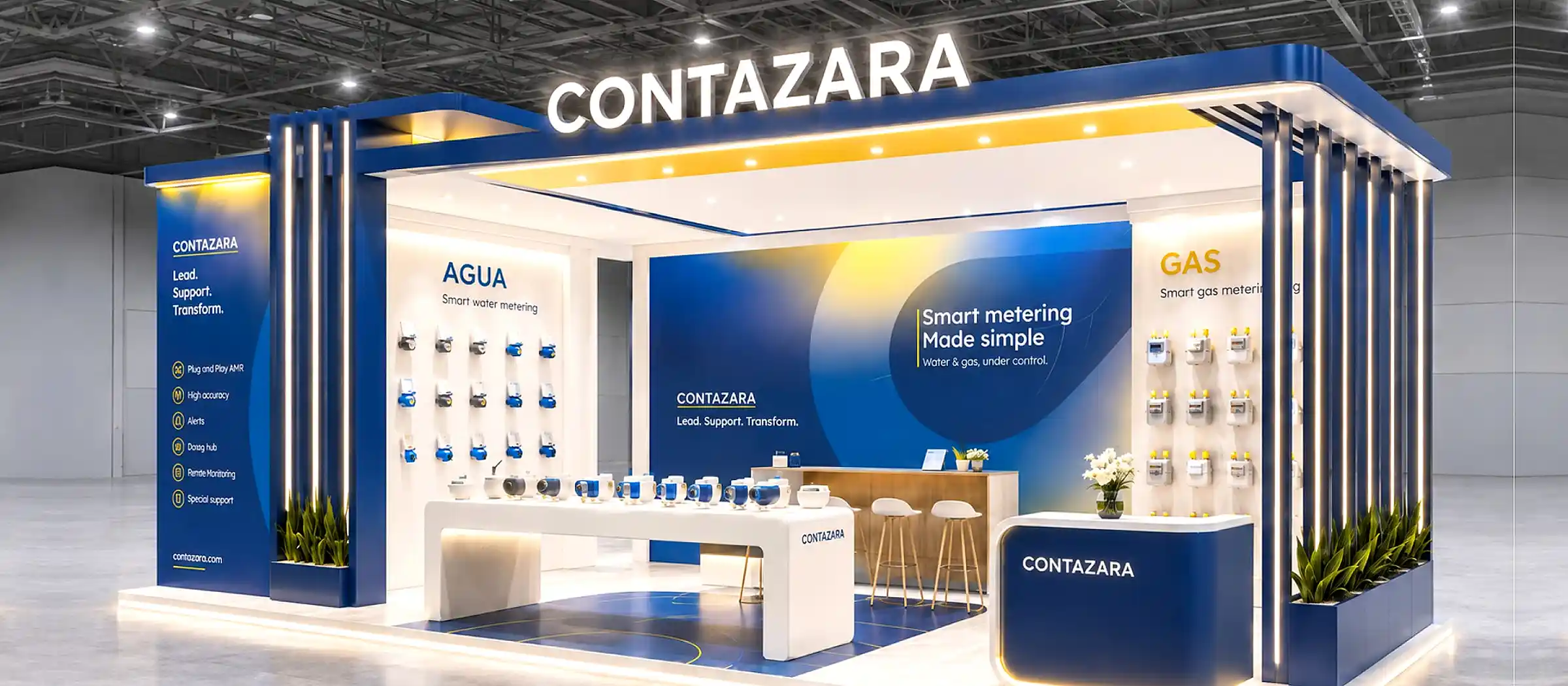
-
A site that gives ideas room.
Web design for Carceral Ecologies: a clear structure so the content can be read, explored and remembered.
In progress
-
Putting culture in the hands of its audience.
A participatory platform connecting audiences, artists and venues to make new performances possible.
View project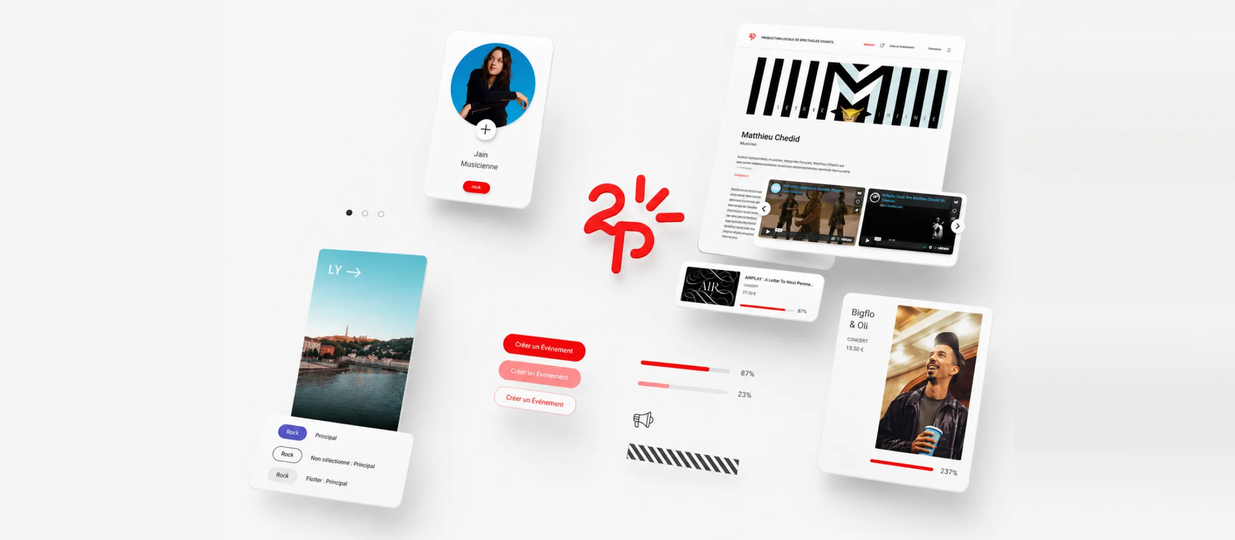
-
Less screen time. More real life.
An app bringing people together through real activities, with fewer taps, smarter filters and rewards for taking part.
View project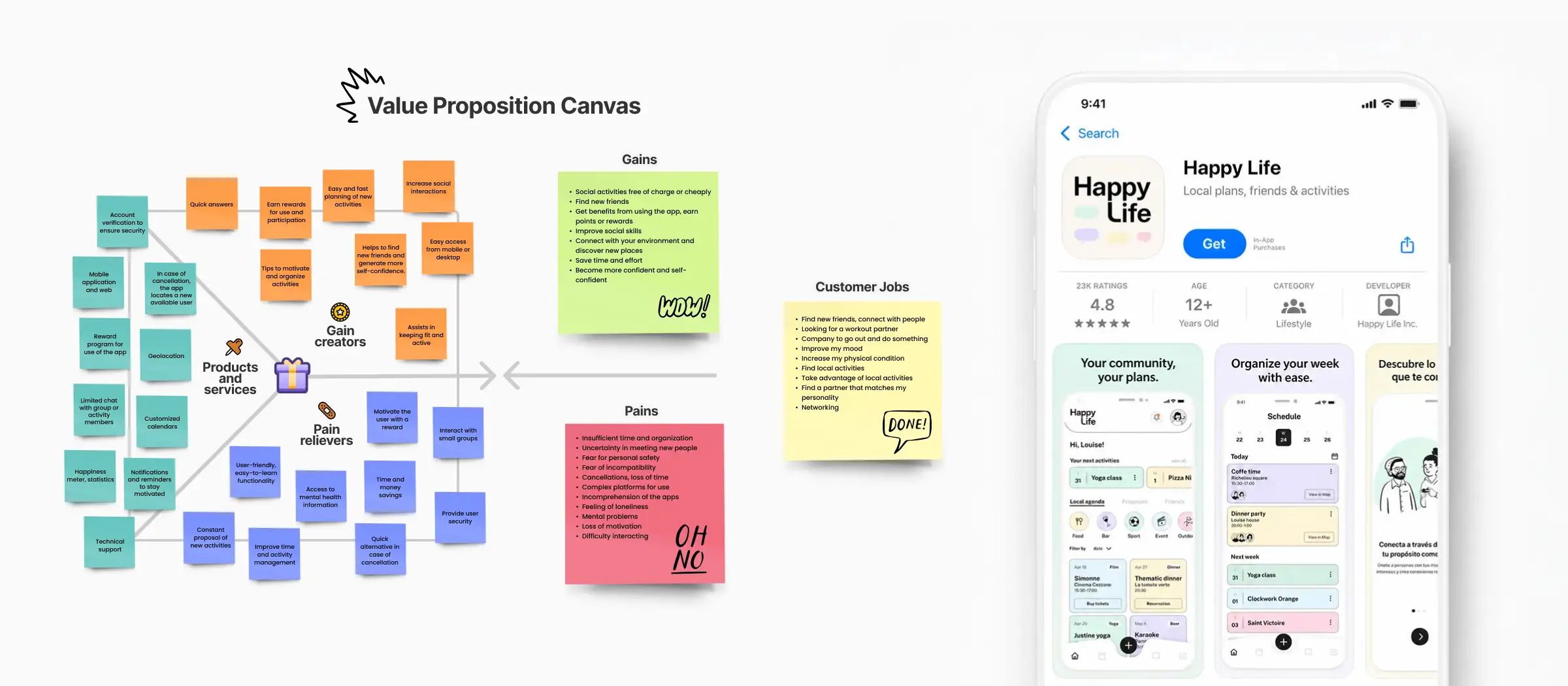
Good ideas. Thoughtfully made.
Not every project needs the same thing. Some start with a brand, others with a website, and some with a digital experience that just isn't working as it should. I help figure out what matters and find the right way forward.
- 01
Branding & identity
A brand with something to say.
I build and evolve brand identities that help businesses become recognizable, stand apart and connect with the right people.
- Brand strategy
- Visual identity
- Rebranding
- Art direction
- Brand systems
- 02
Web design & development
A good website should do more than look good.
I design and build websites that communicate clearly, work smoothly and help turn visits into opportunities.
The right technology follows the project, not the other way around.
- Web design
- Webflow
- Shopify
- WordPress
- Framer
- Custom development
- 03
Digital product, UX/UI & digital strategy
Less friction. More purpose.
I design and improve digital experiences so they're intuitive, useful and easy to navigate, without losing sight of business goals.
- UX research
- Interfaces
- Prototypes
- Design systems
- UX audits
- Product strategy
Understand first. Surprise later.
I don't start with screens or colors. I start with questions.
- 01
Listen and understand
We talk about your project, your business, your audience and the problem worth solving.
- 02
Find the direction
We organize ideas, set priorities and agree on an approach that makes sense.
- 03
Design and build
Strategy takes shape. I design, develop, test and refine until the solution comes together.
- 04
Refine and evolve
We check the outcome, polish the details and leave a solid foundation for what comes next.
It was never just design. And it still isn't.
Straight answers. No runaround.
What kind of projects can you help with?
Branding and identity, web design and development, and digital product design. I can also help shape the strategy if you're not yet sure what you need.
All servicesDo you work alone or with a team?
I'm your main point of contact and work directly on the project. When other skills are needed, I can bring in Binōme Studio and trusted specialists I've collaborated with before.
Get to know meHow much does it cost to work with you?
It depends on your goals, scope and complexity. Tell me what you're planning and I'll put together a proposal around what you actually need.
Do I need to know which platform my website should use?
Not at all. We first understand the project, then choose the best fit—whether that's Webflow, Shopify, WordPress, Framer or a custom solution.
All servicesCan you improve an existing website or brand without starting over?
Absolutely. Starting from scratch isn't always the answer. Sometimes it's better to keep what works, fix what doesn't and build from there.
Do you work with clients outside Spain?
Yes. I'm based in Madrid and collaborate internationally in Spanish, English and French.
How do we get started?
Tell me a little about what you need. We'll discuss your goals and scope and, if we're a good fit, decide how best to work together.
Good ideas start with a conversation.
You have an idea. I have a few questions.
Prefer email? hey@tomfabre.com ·
Madrid · Español / English / Français
Every project starts with a different question. And the best answer is rarely just a pretty interface. Here are a few brands, platforms and experiences I've helped bring to life.
Contazara
40 years of history. A new identity shaped together.Carceral Ecologies
A site that gives ideas room.In progressÀ2pas
Putting culture in the hands of its audience.HappyLife
Less screen time. More real life.
Binōme Studio
Two paths. One way of doing things.
Yaypegs
Details you notice.
360estudio
An architectural identity built to match the work.Figy
One idea, well solved.Apolo
A phone that feels like yours.Appy
Fewer steps, more people arriving.Mood Messenger
Chat, your way.Molyb
Making technical simple.HappyLife
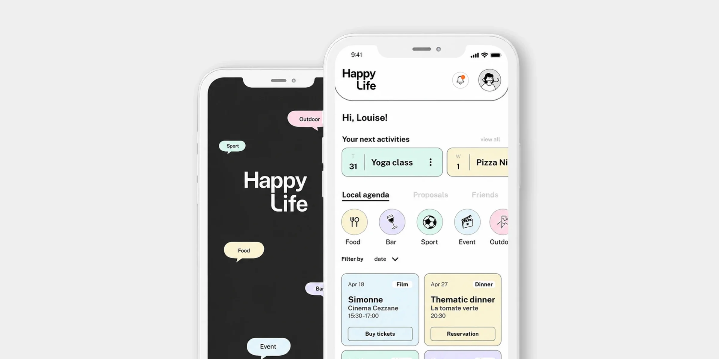
Less screen time. More real life.
An app designed to bring people together through shared activities. Because sometimes what we need isn't another app, but someone to make plans with.
- Role
- Lead Product Designer
- Context
- French startup · Social app
- Services
- UX Research · UX/UI · Prototyping · MVP
- Period
- 2023
01 · The challenge
Designing an app people would want to put down.
After the pandemic, a French startup from Lyon came to us with an idea: help people reconnect in real life.
Loneliness wasn't new. Neither was spending hours looking at a screen while life happened somewhere else.
The challenge came with a contradiction. How do you design an app that brings people closer without making them more dependent on their phones?
The answer wasn't adding more features. It was removing what got in the way.
02 · The experience
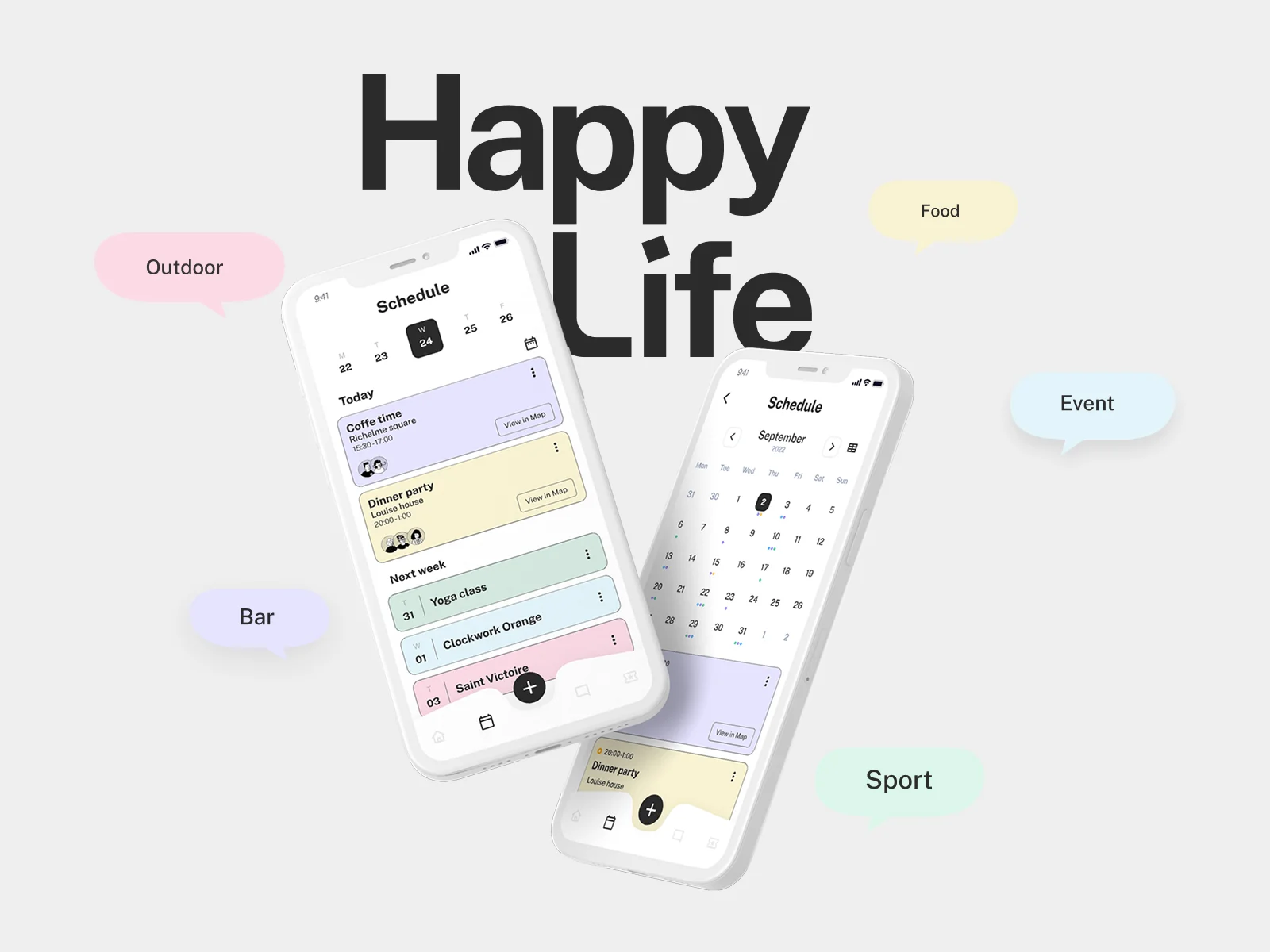
Less searching. More finding.
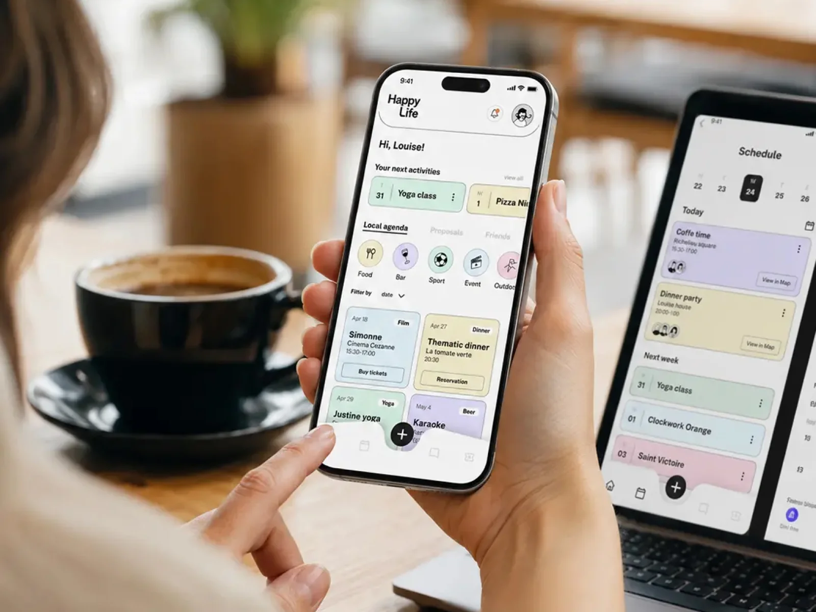
We wanted to avoid endless scrolling, hundreds of choices and the familiar feeling of closing an app without having decided anything.
HappyLife started with three simple things: what you enjoy, when you're free and what you'd like to share with others.
Based on interests and availability, the app could surface relevant activities without making people browse through an endless catalogue.
The complexity belonged behind the interface, leaving people free to focus on what mattered.
Finding a good plan should be easy. Enjoying it should be even easier.
03 · Gamification with purpose
The rewards were waiting offline.
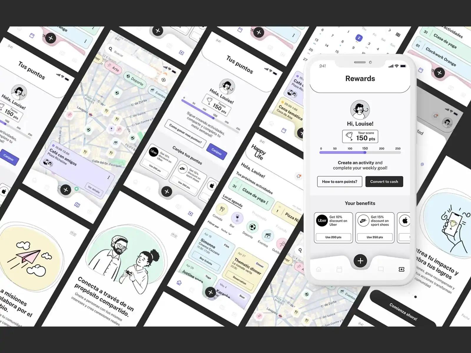
HappyLife included a rewards system designed to encourage real participation.
Meeting people, joining activities and sharing experiences could earn points, redeemable for vouchers and new experiences.
The goal wasn't to reward time spent using the app, but what happened after putting the phone away.
A small distinction that changed the logic of the product.
Less reward for scrolling. More reasons to show up.
04 · Product design
Fewer taps. More time for people.
Our UX/UI approach focused on making every decision simpler.
Quick access, useful filters and short journeys helped people discover activities that matched their interests and free time.
Instead of showing every possible option, we focused on making the relevant ones easier to find.
The product had to handle the complexity, not pass it on to the people using it.
From UX/UI research and prototypes through to bringing the MVP into operation, we kept the same principle: help people find what they needed with less effort.
We didn't need people to do more inside the app. We wanted them to do more outside it.
Value Proposition Canvas and app listing. Conceptual visualisation: the ratings and figures in the listing are part of the mockup, not real metrics. Tap the image to enlarge it.
05 · My work
Designing for what happens after the tap.
We worked on research, experience definition, UX/UI design and prototyping for an app created to make real connections easier.
The project progressed to the MVP implementation stage, bringing design decisions into the first functional version of the product.
The challenge was to turn a social idea into practical product decisions: how to filter activities, what information to show, when to surface relevant opportunities and how to encourage participation without unnecessary friction or dependence.
An experience built around technology knowing when to step aside.
Closing
Life happens beyond the screen.
HappyLife was built around a simple idea: there might always be someone nearby who'd love to share a moment.
Design could help those people find each other.
Have an idea that needs a more human experience? Let's talk.
I've been through a few cities, disciplines and good ideas. Some turned out as I expected. Others taught me a lot more.
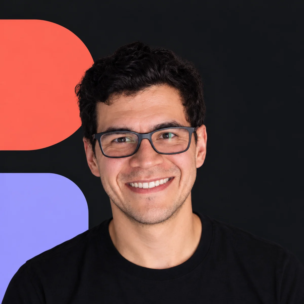
Hi, I'm Tom
Design that connects ideas, people and products.
I blend strategy, branding, digital design and technology to turn complex ideas into experiences that are clear, useful and full of personality.
Moving between Latin America and Europe has shaped how I work: listening, questioning, connecting perspectives and finding solutions that make sense.
My real name is Álvaro Fabre, but my family and friends have always called me Tom. That's why Tom is the name I'd rather you know me by.
I don't design to impress other designers. I design for the people on the other side of the screen.
Off the screen
A few pieces of the personal map.
- Film
- Music
- Travel
- Cycling
- Camping
- Walking
- Technology
- News
- Products
- Art
- Cooking
Three cities, three schools.
If jobs are a school, it's the best one: it tests you, teaches you, sometimes stresses you out and, truth be told, you're always grateful. Experience is the best master's degree in the world.
- 2022 — nowBinōme StudioLead Product Designer & Co-founder · Madrid
- 2018 — 2022MadSevenSenior UX/UI Designer · Aix-en-Provence
- 2015 — 2017INGCUX/UI Designer · Santiago
What I do.
One way of thinking, many ways of making it real: from the first sketch to the last line of code.
- Branding
- Web Design
- Product / UX
- App Design
- Design Systems
- Art Direction
- Prototyping
- Accessibility
My toolbox.
Figma to think, Webflow and code to build, Maze and Hotjar to check it works. Hover and each one lights up in its own colour.
- FiFigma
- WfWebflow
- </>HTML / CSS
- SbStorybook
- MzMaze
- HjHotjar
- NoNotion
- JiJira
A quick game before you go on.
A fleet is hiding on the board. Every ship you sink tells you how I work. You get 20 misses; hits are free. And if you sink the whole fleet, there's a prize.
Pick a cell. Start anywhere.
Ship of 4 cells · still hidden
Ship of 3 cells · still hidden
Ship of 3 cells · still hidden
Ship of 2 cells · still hidden

You have an idea. I have a few questions.
What happens next?
You tell me
What you're working on, what's getting in the way or what you'd love to achieve.
We figure it out
I'll share my perspective and we'll explore how I can help.
We make it happen
If we're a good fit, we'll define the scope and get started.